(No video was used in the creation of these animations—still photos only.)
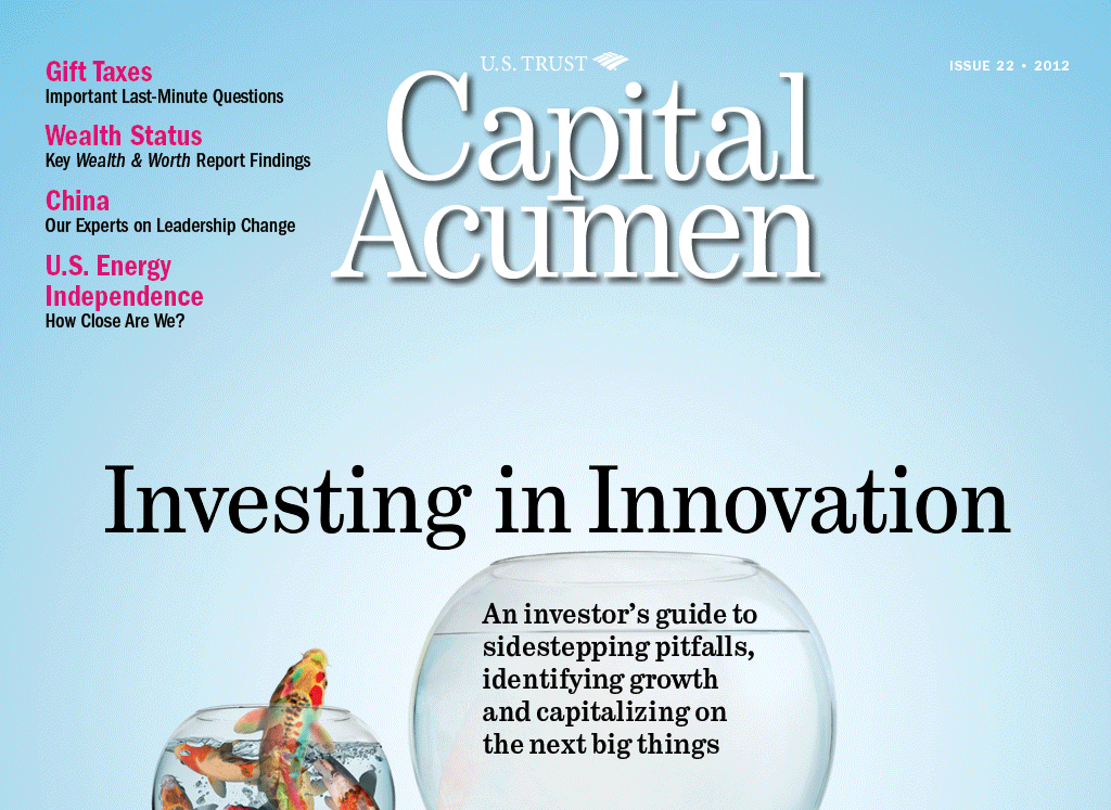


CAPITAL ACUMEN iPAD APP | COVER (1/2)
I love the way the fish moves and how it begins to tell a story—which is then finished when the user
taps on the cover image and goes to the feature opener (see next slide).
CAPITAL ACUMEN iPAD APP | COVER STORY OPENER (2/2)
Now the fish turns the clear water blue. Extensive use of the Puppet Warp function in Photohop!
The client loved these animations and it brought a sense of delight to the app (and the website).
CAPITAL ACUMEN iPAD APP | FEATURE OPENER
One of my favorites: a simple but expressive graphic. All of these were made from still photos
but this one was the most radical transformation: I had to teach myself 3D mapping in Photoshop.
CAPITAL ACUMEN iPAD APP | FEATURE OPENER
My theory of looping animations is that they should never be distracting or annoying (though you have
more latitude with a feature opener like this where the reader is not expected to linger).
This is a good example of the “ambient” type, simply bringing the image to subtle life.
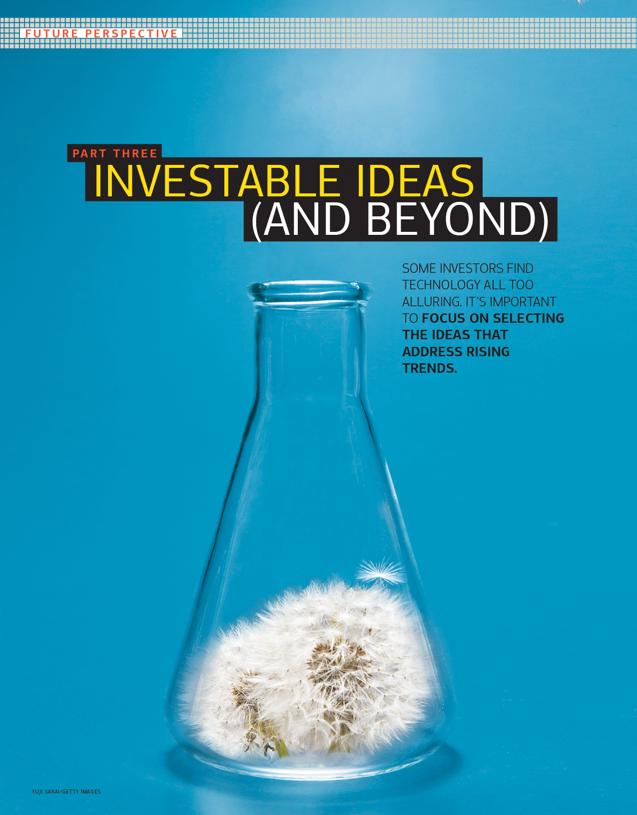
CAPITAL ACUMEN iPAD APP | FEATURE OPENER
I love the little bounce at the end. We had a whole series of dandelions for this special section.
On the cover, one floret detatches itself and floats away.
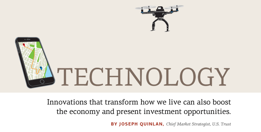
CAPITAL ACUMEN iPAD APP | HERO ANIMATION
I like the way the word “disruptive” literally disrupts the word “technology” and is then
delivered by drone to its proper place in the headline.
LOGO FOR AUTHOR WEBSITE | pollyshulman.com
Polly’s books draw on her love of old-timey authors like Jane Austen and H. G. Wells,
but they have a cheeky, comical quality which inspired this animated logo.
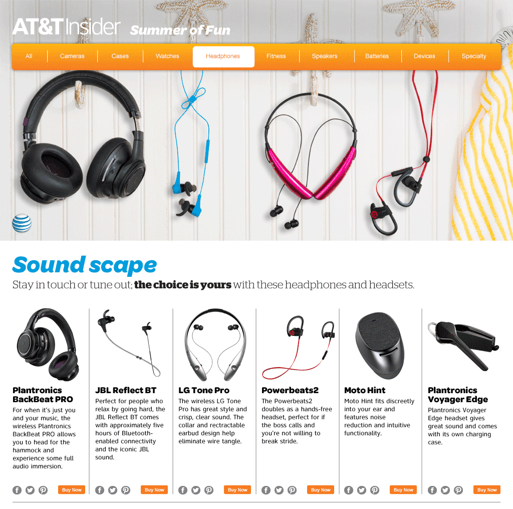
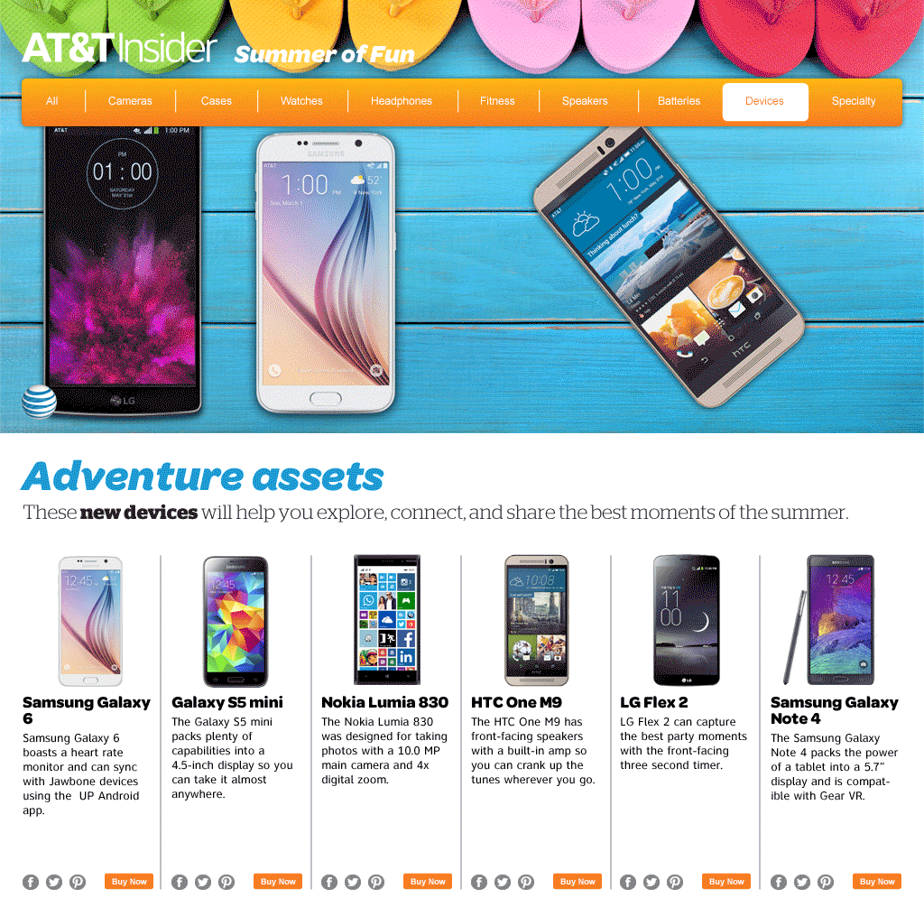
AT&T MICROSITE | HERO ANIMATION (1/2)
I was asked to bring nine hero images to life for this microsite. This is another “ambient” one
that doesn’t tell a story so much as express a mood through motion.
AT&T MICROSITE | HERO ANIMATION (2/2)
This one tells a tiny story: the kite floats from phone to phone trailing the summer sky in its wake,
but also expresses the idea of sharing between devices.
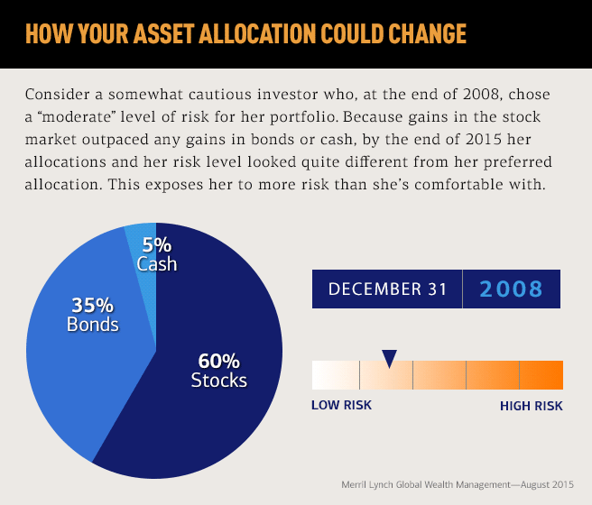
MERRILL LYNCH ADVISOR | INFOGRAPHIC
This one was tricky, with four moving parts: the hed literally “changing over time,” the pie chart,
the date counter, and the risk slider all showing the changes from 2008–2015 in asset allocation.