(No video was used in the creation of
these animations—still photos only.)
Tap on the images for info

CAPITAL ACUMEN iPAD APP
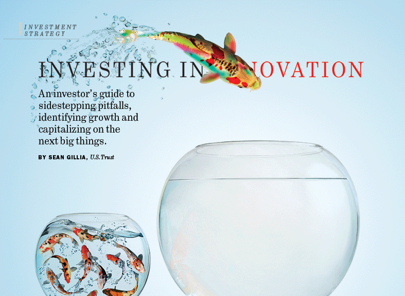
COVER (1/2)
I love the way the fish moves and how it begins to tell a story—which is then finished when the user taps on the cover image and goes to the feature opener (see below).
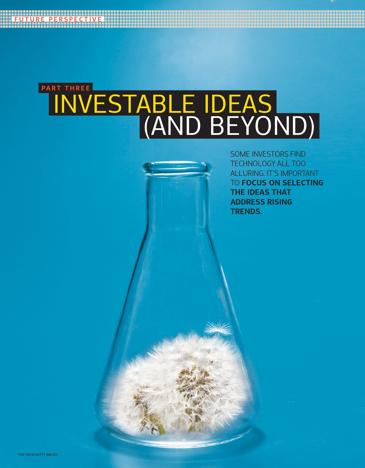
CAPITAL ACUMEN iPAD APP
COVER STORY OPENER (2/2)
Now the fish turns the clear water blue. Extensive use of the Puppet Warp function
in Photohop! The client loved these animations and it brought a sense of
delight to the app (and the website).

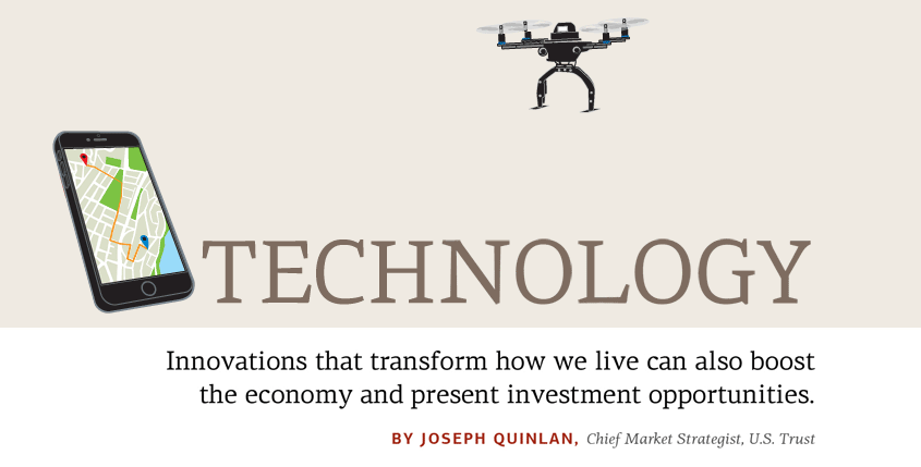
CAPITAL ACUMEN iPAD APP FEATURE OPENER
One of my favorites: a simple but
expressive graphic. All of these were made from still photos but this one was the most radical transformation: I had to teach myself 3D mapping in Photoshop.

CAPITAL ACUMEN iPAD APP FEATURE OPENER
My theory of looping animations is that
they should never be distracting or annoying. This is a good example of
the “ambient” type, simply bringing
the image to subtle life.
CAPITAL ACUMEN iPAD APP FEATURE OPENER
I love the little bounce at the end. We had a whole series of dandelions for this special section. On the cover, one floret detatches itself and floats away.
CAPITAL ACUMEN iPAD APP HERO ANIMATION
I like the way the word “disruptive” literally disrupts the word “technology” and is then delivered by drone to its proper place.


AT&T MICROSITE
HERO ANIMATION (1/2)
I was asked to bring nine hero images to life for this microsite. This is another “ambient” one that doesn’t tell a story so much as express a mood through motion.
AT&T MICROSITE
HERO ANIMATION (2/2)
This one tells a tiny story: the kite floats
from phone to phone trailing the summer
sky in its wake, but also expresses the
idea of sharing between devices.
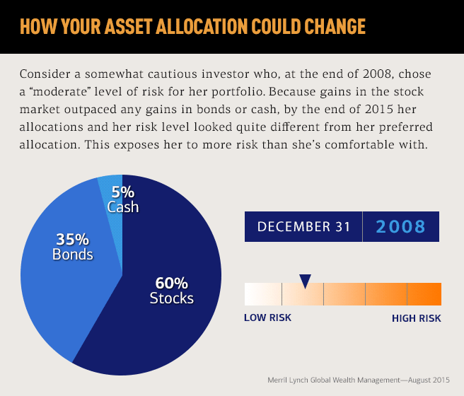
MERRILL LYNCH ADVISOR INFOGRAPHIC
This one was tricky, with four moving parts: the hed literally “changing over time,” the
pie chart, the date counter, and the risk
slider all showing the changes from
2008–2015 in asset allocation.